Sydney - barely there, already gone
வெளியிடப்பட்டது: 10.12.2018
செய்திமடலுக்கு சந்தாதராகவும்
What stands out first when returning to "civilization" with subway, tap water, croissants, and restaurants with creative cuisine after weeks (for a very short time)? The people are well-nourished (meaning: many are rather overweight than thin). Their clothing is short, very short, and otherwise airy. And there is Christmas - or something similar. Despite red Santa hats, decorated trees, and Jingle Bells, as a native Austrian, I don't really feel the Christmas spirit when it's 23 degrees Celsius and everyone is walking around in shorts and tank tops.
Only five days for a whole continent? A bit too little, don't you think? We visit some countries very extensively on this world trip (like Georgia and Uzbekistan) and some only selectively, picking out our own "raisins" (like in India). We have taken the "raisin approach" to the extreme here in Australia and stayed in Sydney for only 4 and a half days. It was actually just about one single raisin that I thought I would never see because Australia has a lot of beautiful landscapes but rather few cultural landmarks - and therefore it is not on our travel wish list (it should be clear from the previous blog posts that we prefer churches or temples over waterfalls or mountains). So, the Australian raisin is the Sydney Opera House.
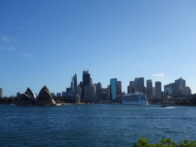
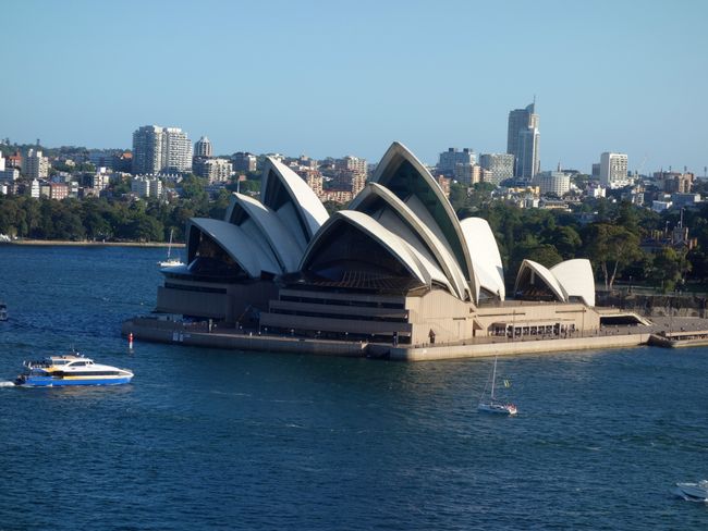
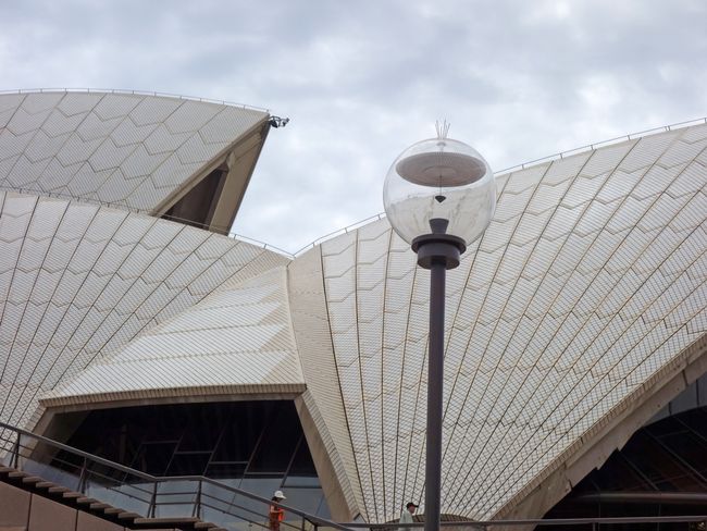
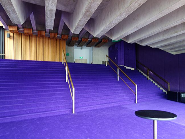
No, it's not about opera, as some of you (who know us a little better) might assume, but about architecture. We not only love ancient buildings, but also the architectural masterpieces of the 20th and 21st centuries. The Sydney Opera House, designed by Danish architect Jørn Utzon in the late 1950s, is considered such a masterpiece. It looks stunning in photos, and I have always wanted to see it. The reality, however, did not live up to the promises of the photos. One reason is that many photos cut out the clumsy brown base (which is very dominant in reality) and only show the "sails". Second, the building is not nearly as big as I had imagined, or it is visually diminished because a skyline of skyscrapers has been built right behind it since its construction, making it appear rather small. The interior spaces were not designed by Utzon, but were created in the 1970s (since the construction took much longer than the planned three years), and you can see it: purple carpets, brown tinted windows, and bulky shapes, typical of the seventies, as they should not be. Despite (or because of) my disappointment, I circled the building almost daily and took almost 100 photos of it, from the water and the land, from all possible angles - to document the beautiful and the ugly.
Photos (even professional ones) often don't do justice to buildings. In New York, we had the opposite experience: We went to the famous Metropolitan Museum of Art to attend performances and didn't expect anything from the architecture (which we knew from pictures). But the building (from the 1960s), especially in the evening lighting, is stunning. The huge colorful paintings that Mark Chagall painted exclusively for the Met and ingeniously integrated into the architecture make a big impression from the outside and inside - and although the interior is a bit flashy, the Met is a highly elegant, radiant structure. Really good.
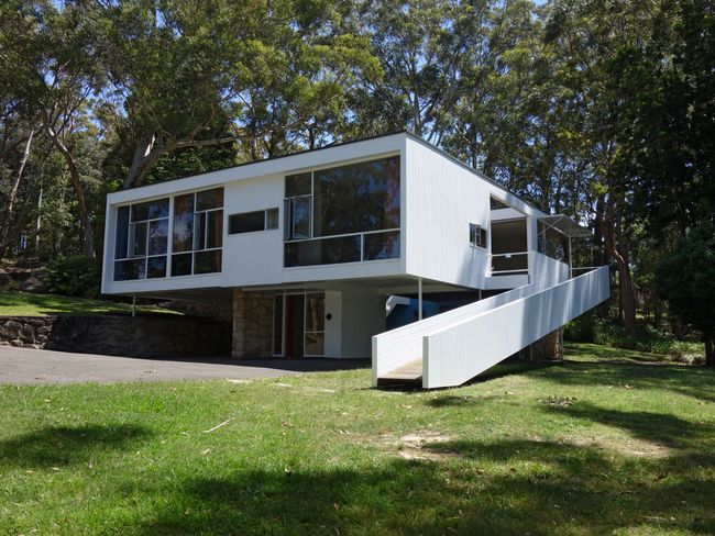
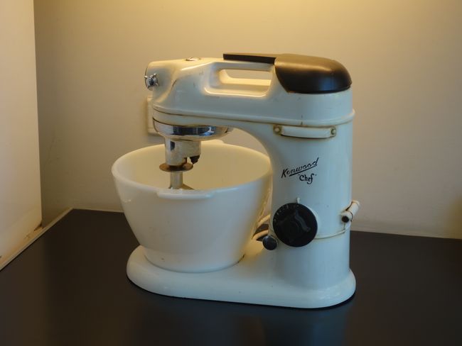
Interestingly, we had very similar aha moments in Sydney and New York, which reminded us of how limited our knowledge is. Our Sydney travel guide briefly mentions that Harry Seidler is the most important Australian architect. That's why we took a journey of more than an hour to visit the (externally and internally preserved) small villa that Seidler designed and built for his mother Rose: from 1947, on a hill that was still bushland at the time. There was already a dishwasher (an impressive thing) and a Kenwood kitchen machine (which is much prettier than mine). If you know European architecture since Bauhaus and Le Corbusier, Rose Seidler's house may not offer any innovations, but it is very successful. And for Australia, it was revolutionary at that time, as we learned from a short film on site, which revealed more about Harry Seidler: among other things, that he was born in Vienna, fled from the Nazis, and returned in the 1990s to build a high-rise building and a residential building on the New Danube. We had never heard the name Harry Seidler before, just as we had never heard the name Josef Urban. A few years ago, during the "Open House New York" event, we hurried to join a guided tour of an events center that had been created by Dschosef Örbän (that's how the guide pronounced it), with a spectacular theater hall with lots of aluminum as a design element: something very special, as almost nothing remains of the famous Örbän, as he specialized in stage sets for the major US revues of the interwar period and for films. We were enthralled and amazed to find out that Urban was Viennese and had designed the Rathauskeller at a young age. The good news is that you don't have to eat there to look at Urban's early work ;-), which, by the way, has no resemblance to the building in NYC.
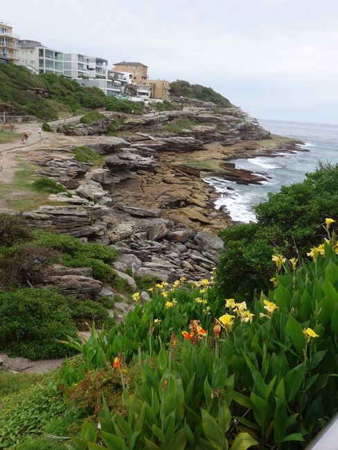
The best thing about Sydney is its beautiful seaside location. The numerous bays around which the city is built provide plenty of fresh air and wonderful views of the water and the boats. The city is green, green, and green along the winding and long coastline. The houses give an idea of how wealthy the city and many of its residents are, who only have a short way from their waterfront house to the next swimming opportunity.
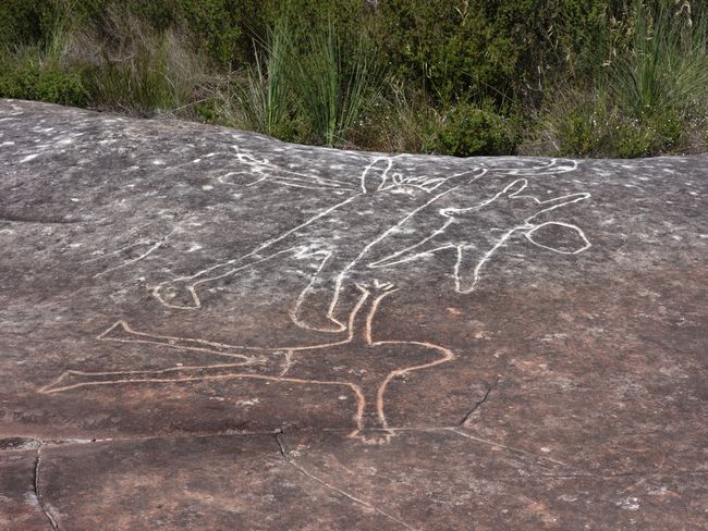
The city is also green because it is surrounded by many national parks where you can see what the "real" Australians have left behind. Exploring the rock drawings of the Aboriginal people is fun: because of the beautiful landscape and the small kangaroos, fish, and humans depicted there.
செய்திமடலுக்கு சந்தாதராகவும்
பதில்
